This student project was to design a newsreader app. Gallivant is a startup travel news app. The app’s goal is to educate, inform, and empower female travelers through a curated content stream of travel-related news. Through sharing and collaboration features, Gallivant also hopes to connect women with other like-minded individuals.
Why an app focused on women? Women make up a huge segment of the tourism and travel industry with 80% of the industries purchases made by women. In fact, women have $15 trillion dollars of spending power in the travel market and are strongly represented in every facet of the travel industry. Solo travel is a huge trend for women with approximately 11% of women traveling solo each year. Likewise, the average adventure traveler is a 47 year old female.
UI/UX Design
Figma, Invision, Illustrator
Research, Sitemap, Wireframes, Prototypes, UI Design
Based on the target market research Gallivant’s average user is a female between the ages of 35-54 years old with a household income of $58,000 - $68,000 per year, is unmarried with no children, and holds a bachelors degree or higher. She is well-educated, socially active, and has some disposable income. She prefers to travel solo or with other female friends. She is an experiential traveler and likes to gather information and immerse herself into the culture of a location. This user wants an app that is informative, focuses on cultural and women's issues, and provides a unique and customizable experience.
Gender:
90% female
Age:
35-54 years old
Annual Income:
$58K- $68K
Level of Education:
Bachelor's degree +
Marital Status:
Single
Benefits Desired:
informative, unique
Based on this research, I crafted two personas to represent Gallivant's typical users.

35 year old single accountant from Tampa, FL
Behaviors
Going out with friends, casually dating, finding new adventures, budgeting and saving for the future
Goals
Travel to every continent, take a solo trip to Paris, learn more about herself
Frustrations
Societies opinions/expectations of female travelers, expense of traveling, no single source of travel information that seems relevant to her

53 year old divorced non-profit manager from Charlotte, NC
Behaviors
Often travels for work, likes to read and learn about different cultures and customs, wants to travel more for pleasure
Goals
Hiking Machu Picchu, retiring and traveling more, living a more simple life
Frustrations
Too many different sources of information, it's hard to organize and save travel information she finds, doesn't have enough time for planning and researching

Based on the research, a complete sitemap was created that would offer users a curated news feed and the ability to save and organize content within the app.

Wireframes were created for a homepage which will showcase curated content based on user preferences, a latest news feed, a specific article, and the user profile. Inside the user profile the user can save and organize news stories of interest into categories.
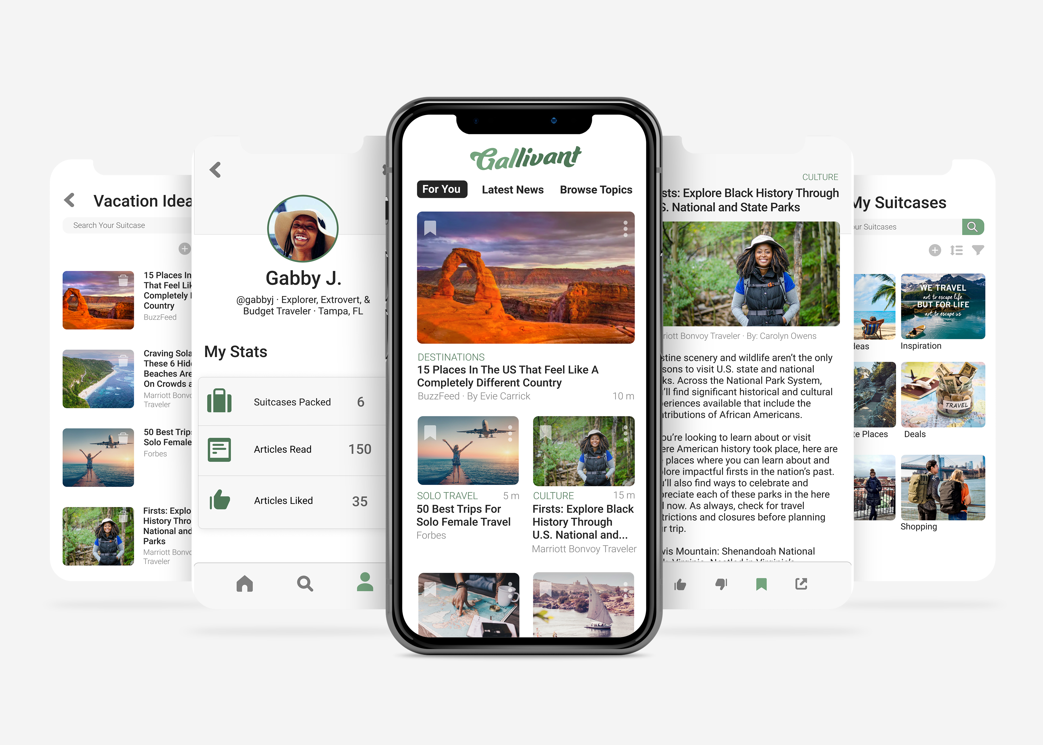
The final design of the Gallivant app incorporated slightly rounded elements to add a softer feel and simple colors including white, shades of gray, and the lighter green from the Gallivant logo. Roboto was chosen as the typeface since it is a standard system font and works well in various sizes.
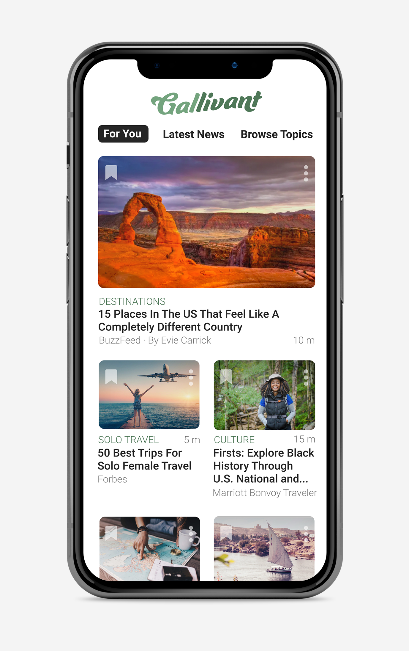
The home screen coincides with the “For You” news category that is curated based on the articles the user has liked and disliked, as well as the topics they follow. Offering this category first allows the user to immediately see the stories most relevant to them.
Each article includes a bookmark icon that allows the user to add the article to their “suitcase”- their own user created categories. Each article also includes a drop-down list in the form of a dots icon that allows the user to bookmark, share, like or dislike the article without having to click into the article itself.
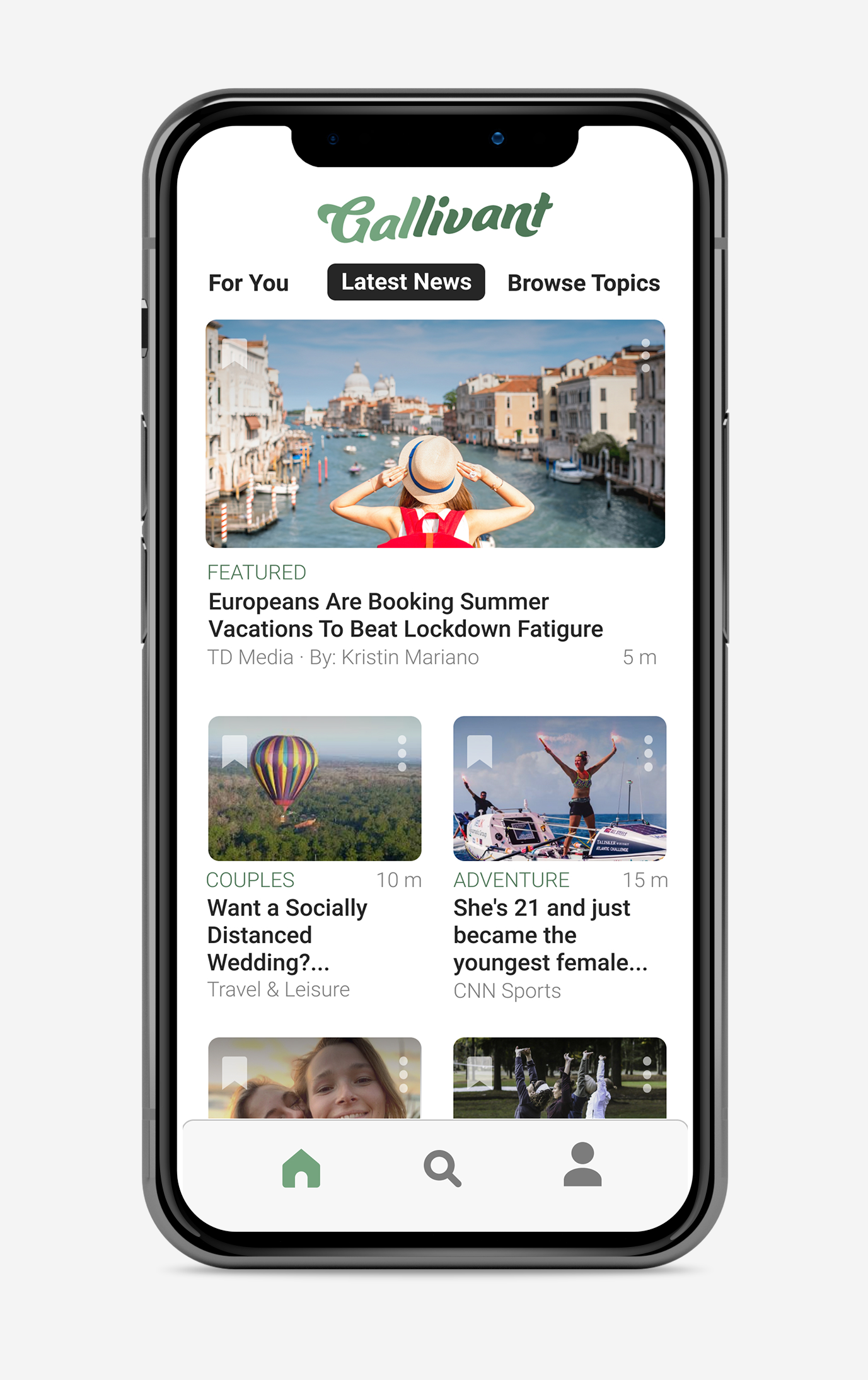
The latest news screen follows the same format as the “For You” screen for consistency. This screen includes news articles posted to the app most recently. Next to the news source for each article and the author you will also find the estimated reading time. This feature was added to improve the user experience by being transparent with the users who are often busy and may have limited time for browsing and reading.
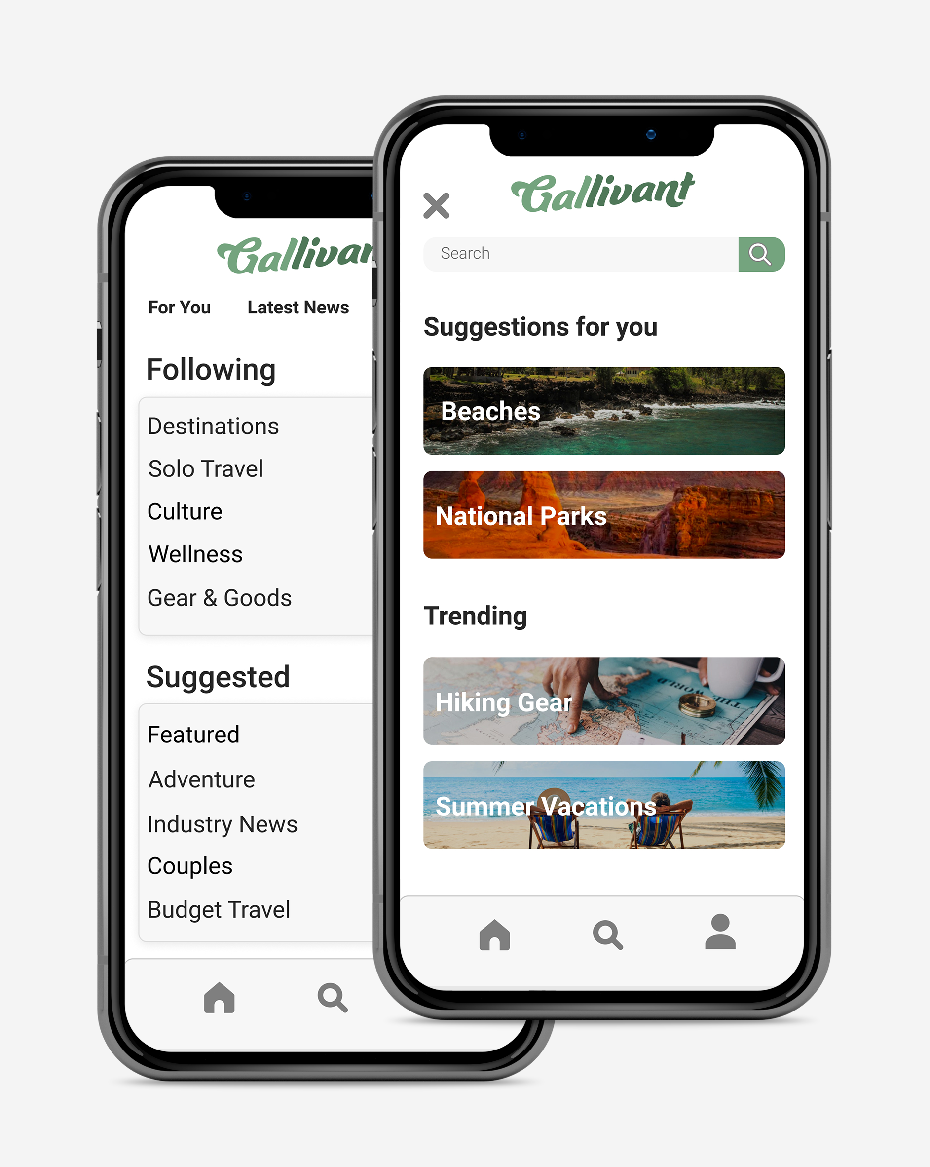
The “Browse Topics” screen organizes the app’s contents into categories in order to make it easier for the user to discover new content and customize their experience. Here they can see which topics they follow, unfollow a topic, or follow a new topic. They can also browse news within each of these categories.
The “Search” icon allows users to search for content throughout the app via keyword. The page also offers suggestions based on trending topics and user likes.
Each article includes the article topic area, as well as author and news source. The bottom navigation again gives the user the option to like, dislike, bookmark, or share the articles content. The user can also comment on the article or read comments left by other users. The “share” icon would allow the user to share the article on social media, send it via email or text, or save it to their device. The below example shows what this option would look like on an iOS device.

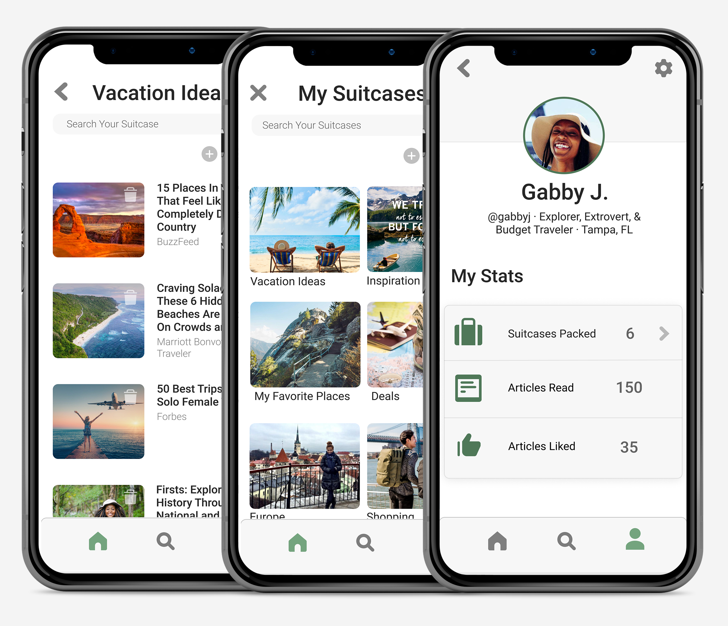
The user profile page includes a settings/utilities icon where the user can update any of their profile and app settings. The profile also provides the user a quick overview of their activity and allows them to view all of their “suitcases”. There is a search function within the suitcases for ease of use. The user can also add, sort, and filter their suitcases to further manage their saved content.
The screen to the right shows the articles saved within one of the suitcases. This screen offers the same search, add, sort, and filter functions as well as the option to add a collaborator.